3.4 Layout Grid
This is a sample section from the chapter “Layout Grid”.
Previously, I shared this tip in a blog post.
Layout Grid and Constraints
Using a Layout Grid and Constraints together is one of Figma’s lesser-known features, most likely because there is no visual indication of the connection in the app UI. This feature can be discovered only by accident or from reading documentation.
A Layout Grid is not just a visual aid. When applied to the frame, it helps Figma align nested objects when the frame is being resized. If you use stretchy grids, an object’s Constraints will be based on the nearest column or row of the grid instead of the frame. This helps maintain fixed gutters and results in more realistic scaling behavior.
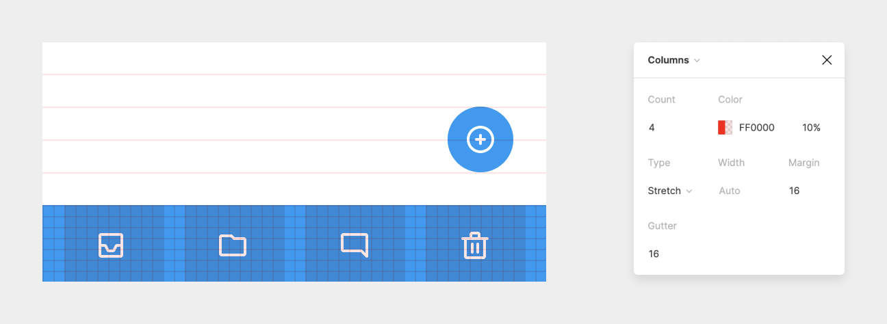
Let’s return to our email app example, and apply a Layout Grid with Columns to the toolbar.

Icons are aligned to the columns, and their Constraints are set to Center and Center. When we change app orientation to the landscape now, they’re properly distributed on the toolbar.
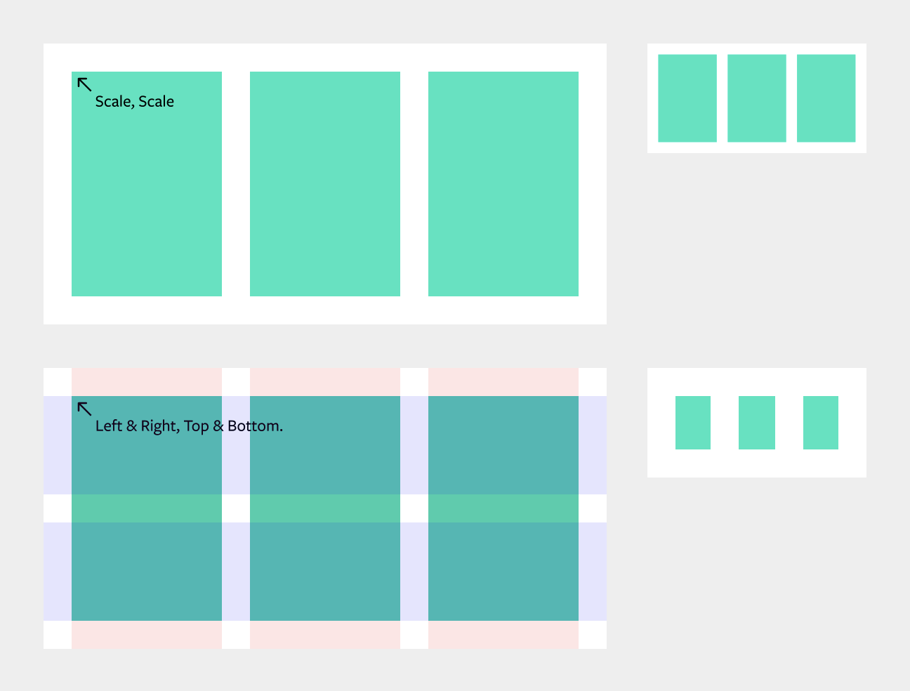
The same technique can be used for maintaining fixed gutters and margins when resizing the frame. In the top example, a Layout Grid wasn’t used, and both horizontal and vertical Constraints on the green blocks were set to Scale. When the parent frame is resized, both gutters and margins are scaled proportionally. On the bottom example, a Layout Grid was defined with stretchy columns and grids, and green blocks’ constraints were set to Left-Right and Top-Bottom. When resized, all objects stick to the grid.

